IDFC bank
IDFC bank
Boosting Conversions.
Reducing Dropouts.
Boosting Conversions.
Reducing Dropouts.
Boosting Conversions.
Reducing Dropouts.


Role
Role
Research, Wireframes, UI Design
Research, Wireframes, UI Design
Timeline
Timeline
Feb 2022 - Dec 2022
Feb 2022 - Dec 2022
Team
Team
Me (Design),
Pallavi Koyande (Design),
Sameer Dave (Dev),
Vishal Panchal (Dev),
Prathamesh Patil (PM)
Me (Design),
Pallavi Koyande (Design),
Sameer Dave (Dev),
Vishal Panchal (Dev),
Prathamesh Patil (PM)
01
01
OVERVIEW
OVERVIEW
When I was at VMLY&R, I got to dive into designing a banking product for the first time. I was a bit nervous at the start, but my awesome colleagues helped me through it.
Our team tackled several parts of the IDFC website, like the Credit Card Pages, Gold Loan Calculator, their internal site for employees, and many more.
This particular project is about users dropping out on the first visit during the product discovery pre-login process, leading to lower conversion rates.
02
02
RESULTS
RESULTS
This first because business and design should go hand in hand.
This first because business and design should go hand in hand.
IMPACT OUR WORK HAD
IMPACT OUR WORK HAD
24% increase in click through rate (CTR)
24% increase in click through rate (CTR)
63% increase in time on page
63% increase in time on page
15% reduction in project timeline
15% reduction in project timeline

03
03
VISUAL DESIGN
We were restricted to the existing design guidelines but we tried to our best.
We were restricted to the existing design guidelines but we tried to our best.
IDFC FIRST WOW! CC ONBOARDING
IDFC FIRST WOW! CC ONBOARDING


COMPARISION TABLE
COMPARISION TABLE


INCLUSIVE OFFERINGS


CREDIT CARD LANDING PAGE
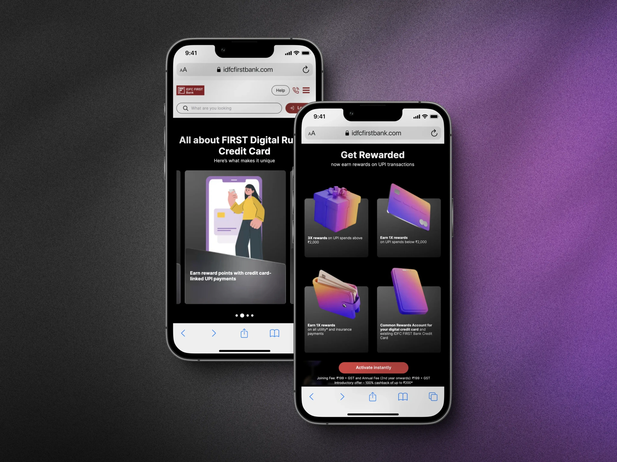


FINANCIAL CALCULATORS
FINANCIAL CALCULATORS


BLOGS
BLOGS


04
04
DESIGN OUTCOME
DESIGN OUTCOME
Customers should derive value effortlessly from each interaction
Customers should derive value effortlessly from each interaction
HUMAN CENTERED APPROACH
HUMAN CENTERED APPROACH


• Easy-to-understand interactions that use familiar language for the users.
• Easy-to-understand interactions that use familiar language for the users.
• Adding a personal touch and being clear.
• Reliable help when you need it.
• Reliable help when you need it.
SCALABLE DESIGN SYSTEM
SCALABLE DESIGN SYSTEM

Goal based product discovery
Goal based product discovery
We designed the homepage with a clear goal: highlight the product in a clean, minimalistic header. The Call to Action (CTA) and quick links were placed strategically for easy access.
We designed the homepage with a clear goal: highlight the product in a clean, minimalistic header. The Call to Action (CTA) and quick links were placed strategically for easy access.
Empowering decision-making by transparency
Empowering decision-making by transparency
We created unique CMS templates for each product, focusing on key details to help users make informed decisions. We emphasized transparency to build trust with customers.
We created unique CMS templates for each product, focusing on key details to help users make informed decisions. We emphasized transparency to build trust with customers.
Easy navigation


We aimed to serve diverse sectors by defining our audience and optimizing navigation for accessibility. We grouped relevant categories and organized them with a user-centric perspective for ease of use.
We aimed to serve diverse sectors by defining our audience and optimizing navigation for accessibility. We grouped relevant categories and organized them with a user-centric perspective for ease of use.
Visual Clarity and Easy Discovery
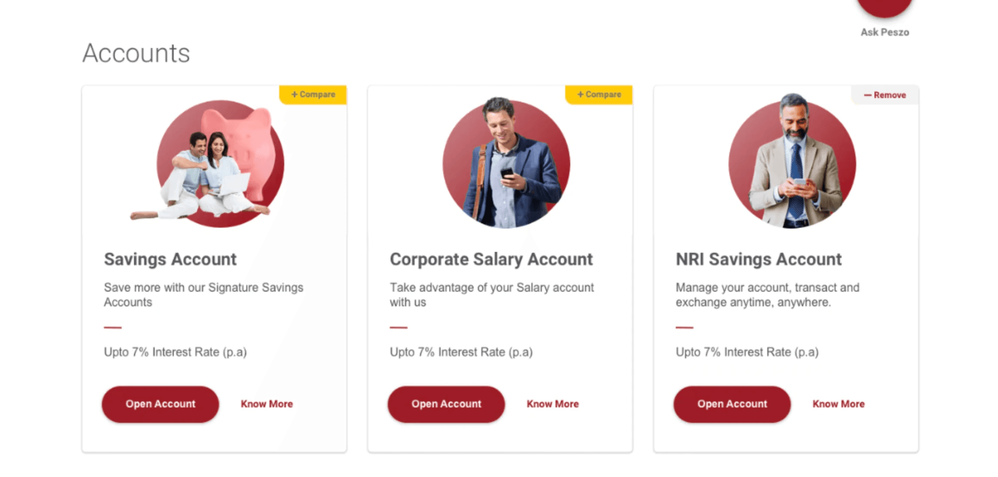


Creating a balance of categories and visual appeal to help users quickly find their desired account using clear visual cues.
Creating a balance of categories and visual appeal to help users quickly find their desired account using clear visual cues.
05
05
CONTEXT
CONTEXT
Let's first understand what was wrong before I show you how we fixed things
Let's first understand what was wrong before I show you how we fixed things
THE PROBLEM
THE PROBLEM

“I was looking to apply for a credit card. But I got confused, every product offering looks the same.” - IDFC Bank User
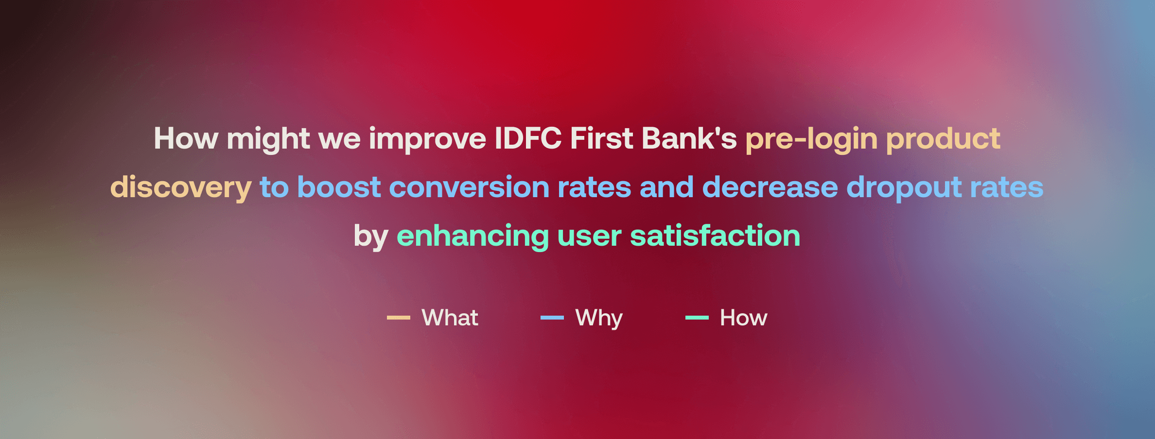
THE CHALLENGE
THE CHALLENGE
06
06
RESEARCH LEARNINGS
RESEARCH LEARNINGS
Things that we learnt about the product and peoplealong the process.
Things that we learnt about the product and peoplealong the process.
CROSS TEAM COLLABORATION
We collaborated with 15 product owners to map out customer journeys and identify opportunities for accounts, deposits, loans, credit cards, investments, and payments.
We collaborated with 15 product owners to map out customer journeys and identify opportunities for accounts, deposits, loans, credit cards, investments, and payments.

HELING USERS MAKE INFORMED DECISIONS

• From a general experience to a personalized experience for 'me'.
• From a general experience to a personalized experience for 'me'.
• Experiences driven by the customer journey, focusing on consumer needs rather than product features.
• Experiences driven by the customer journey, focusing on consumer needs rather than product features.
• Shifting from a "you need me" to a "how can I help" philosophy.
• Shifting from a "you need me" to a "how can I help" philosophy.
Product Discovery LEARNINGS
• Clear paths for easy discovery and guidance.
• Clear paths for easy discovery and guidance.
• Creating meaningful engagement beyond just consuming information passively.
• Creating meaningful engagement beyond just consuming information passively.
• Including transparency, safety, and trust indicators.
• Including transparency, safety, and trust indicators.
APPLIcation journey LEARNINGS
• Few documentation requirements.
• Few documentation requirements.
• Human assistance and support available as needed.
• Human assistance and support available as needed.
• Customized offers and deals for a personalized experience.
• Customized offers and deals for a personalized experience.
07
07
KEY TAKEAWAYS
KEY TAKEAWAYS
What I learnt from this entire project.
What I learnt from this entire project.
Navigating Constraints
Navigating financial regulations and security concerns has improved my ability to excel within constraints, leveraging them as opportunities for creative problem-solving.
Navigating financial regulations and security concerns has improved my ability to excel within constraints, leveraging them as opportunities for creative problem-solving.
Early Collaboration with Dev
Early engagement ensured our designs smoothly transitioned into a functional product, with ongoing feedback enabling continuous improvements.
Early engagement ensured our designs smoothly transitioned into a functional product, with ongoing feedback enabling continuous improvements.
REASON with Data
Sharing user research insights validated our design decisions and expedited decision-making, meeting tight timelines to secure stakeholder support and ensure project success.
Sharing user research insights validated our design decisions and expedited decision-making, meeting tight timelines to secure stakeholder support and ensure project success.
NEXT
Let's Collaborate
Drop me an email to abhish3k.design@gmail.com ↗
It only takes 2 calories to say hey!
📍 Currently based: NYC & The Internet

Let's Collaborate
Drop me an email to abhish3k.design@gmail.com ↗
It only takes 2 calories to say hey!
📍 Currently based: NYC & The Internet

Let's Collaborate
Drop me an email to abhish3k.design@gmail.com ↗
It only takes 2 calories to say hey!
📍 Currently based: NYC & The Internet

